
The Logo Evolution Of Lamborghini : Lamborghini's Logo Origin
- grandezgenie
- Sep 19, 2024
- 2 min read
Ferruccio, the founder of Lamborghini, conceived the idea for the logo to resemble a powerful bull.

In 1953, Lamborghini introduced its first logo. The design was not particularly traditional or distinctive for their brand, especially considering their social and related reviews.
It was in pyramid shape, with 3 letters written separately at all 3 end of the Shape. With the full names of Lamborghini himself.

F - FerruccioL - LamborghiniC - Cento1963 it was developed to a logo looking classic but not still Convincing.
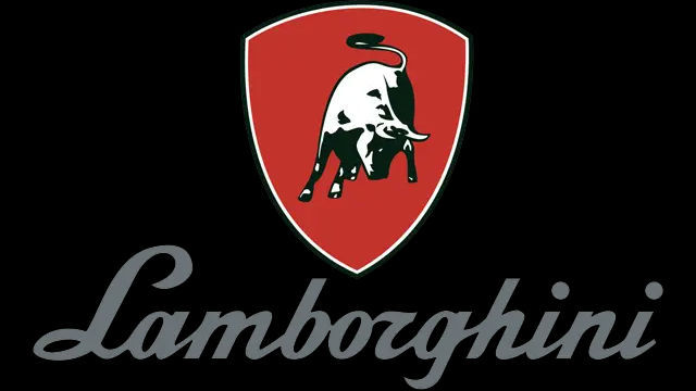
It was a bull (black & white) drawn on a shield (red) and a written word outside below the shield "Lamborghini". The logo was better than the previous one but not the best.
• And so in 1972, it revolutionized to a better classic unique and the best compared to the 2 previous logo ideas. it was dope but then lasted for just 2 years.
This time, the logo featured a golden bull enclosed within a black shield, with the word "Lamborghini" also placed inside the shield.

It got out of hands in relation to Originality, Branding, Uniques and Material style in 1974.
Surprisingly it lasted for 24 good years. At that time Ferruccio the founder was not focusing mostly the Logo development since during time he was foused on the other aspect of the Car's features and not available to maintain the idealistic Logo where he later passed on in February 20th 1993.

After 4 years and a few months, the Lamborghini team updated the logo to the 5th Evolution, which was more materialistic and iconic. This change was based on customer feedback and marked the final design.

Looking at the evolution the Bull is the Main icon
A ❤️ for Ferruccio Lamborghini Cento!


Comments